One of the biggest and most common traps that IELTS candidates fall into when writing Task 1 Academic Training essays involves spending too much time citing specific figures while overlooking the bigger picture that graphic(s) are used to convey.
To be clear: Your goal in Task 1 is essentially to tell a “story” about the graphic(s) so that a reader can quickly understand a general trend or phenomenon, not just provide a series of specific details and statistics. To that end, you must identify the overall takeaway and present it to the reader in a condensed way (no more than a sentence or two) so that the figures you cite can be understood in context of the larger idea.
Although the IELTS Band descriptors may not spell out the point of Task 1 quite so explicitly, they are perfectly clear about what is required to score Band 7 in Task Achievement: successful candidates must have a paragraph that presents a clear overview of main trends, differences or stages.
Perhaps the most important thing to understand about an overview paragraph is that it should consist of a general description in words and by definition should not include details, i.e., specific numbers. Imagine that you are describing the graph to a child—your explanation should be that clear and easy to comprehend.
Although you have the option of placing this paragraph second (after the introduction) or at the end of your response, I strongly recommend the first option.
By demonstrating upfront that you have accomplished a key part of the assignment, you are more likely to make a good impression—something that may make your examiner more likely to overlook minor errors later on.
Putting the overview early in your response will also make it easier for the examiner to follow your analysis, and to understand why you have chosen to mention the specific figures you eventually cite—both factors that can help you achieve a high score in Coherence and Cohesion.
Moreover, this structure also benefits you as the writer. Placing the overview at the beginning will serve to keep you focused in the following paragraphs, and make it easier for you to identify the numbers that it makes the most sense to mention.
All that said, let’s work with the following graph:
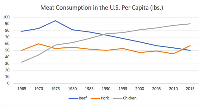
Although each of the three lines in the graph contains many individual points, your primary concern is the overall movement of each line.
We can notice that:
- The line for beef goes from high to low.
- The line for chicken goes from low to high.
- The line for pork goes up and down a bit (fluctuates) but ends not too far from where it began.
Even though there is one “outlier” point for pork—a noticeable rise in the late 1970s—that does not need to be mentioned initially because the focus here is on the general trends.
An overview statement would combine the three main observations into a single statement.
Overall, the consumption of chicken rose during the period shown, whereas it decreased for beef and remained roughly stable for pork.
Note that while this sentence is not overly long or complicated, it meets the definition of a “complex” sentence because it contains both an independent clause or complete sentence (Overall, the consumption of chicken rose during the period shown) and a dependent clause begun by a subordinating conjunction (whereas it decreased for beef and remained roughly stable for pork).
Note also that while there are a couple of acceptable alternatives to overall (e.g., on the whole, in summary, to summarize), you are not expected to be original linguistically when introducing this paragraph and may in fact lose points if you try to use a fancier construction. “Presentation” language relies on certain formulas, and your English will not sound natural for this type of writing if you try to be more descriptive or literary.
To be safe, you should choose which introductory word or phrase you will use ahead of time so that you do not have to worry about deciding during the exam.
The rest of the paragraph would then expand on the initial statement in a general way, again without figures. For example:
In 1965, at the beginning of the period shown in the graph, people in the United States consumed substantially more beef per capita than either of the other two types of meat; however, in the early 1990s, beef was surpassed by chicken, which continued to grow in popularity. By 2015, the amount of chicken consumed per capita was nearly double the amount of either beef or pork.
This paragraph creates a coherent story around meat consumption that a reader can easily follow, largely because there are not too many details to keep track of. When you then cite specific figures in the following paragraphs, the reader will be able to easily place them in the framework you have created.