A couple of posts back, I wrote about a recent Washington Post article in which a tutor named Ned Johnson pointed out that the College Board might be giving students an exaggeratedly rosy picture of their performance on the PSAT by creating two score percentiles: a “user” percentile based on the group of students who actually took the test; and a “national percentile” based on how the student would rank if every 11th (or 10th) grader in the United States took the test — a percentile almost guaranteed to be higher than the national percentile.
When I read Johnson’s analysis, I assumed that both percentiles would be listed on the score report. But actually, there’s an additional layer of distortion not mentioned in the article.
I stumbled on it quite by accident. I’d seen a PDF-form PSAT score report, and although I only recalled seeing one set of percentiles listed, I assumed that the other set must be on the report somewhere and that I simply hadn’t noticed them.
A few days ago, however, a longtime reader of this blog was kind enough to offer me access to her son’s PSAT so that I could see the actual test. Since it hasn’t been released in booklet form, the easiest way to give me access was simply to let me log in to her son’s account (it’s amazing what strangers trust me with!).
When I logged in, I did in fact see the two sets of percentiles, with the national, higher percentile of course listed first. But then I noticed the “download report” button, and something occurred to me. The earlier PDF report I’d seen absolutely did not present the two sets of percentiles as clearly as the online report did — of that I was positive.
So I downloaded a report, and sure enough, only the national percentiles were listed. The user percentile — the ranking based on the group students who actually took the test — was completely absent. I looked over every inch of that report, as well as the earlier report I’d seen, and I could not find the user percentile anywhere.
Unfortunately (well, fortunately for him, unfortunately for me), the student in question had scored extremely well, so the discrepancy between the two percentiles was barely noticeable. For a student with a score 200 points lower, the gap would be more pronounced. Nevertheless, I’m posting the two images here (with permission) to illustrate the difference in how the percentiles are reported on the different reports.
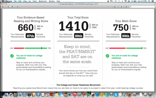
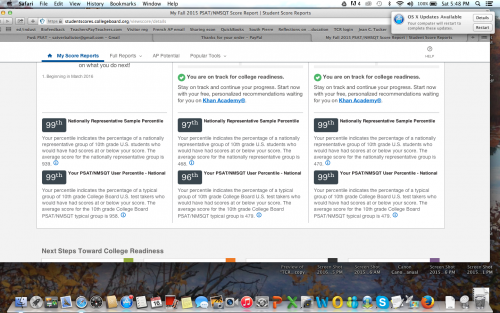
Somehow I didn’t think the College Board would be quite so brazen in its attempt to mislead students, but apparently I underestimated how dirty they’re willing to play. Giving two percentiles is one thing, but omitting the lower one entirely from the report format that most people will actually pay attention to is really a new low.
I’ve been hearing tutors comment that they’ve never seen so many students obtain reading scores in the 99th percentile, which apparently extends all the way down to 680/760 for the national percentile, and 700/760 for the user percentile. Well…that’s what happens when a curve is designed to inflate scores. But hey, if it makes students and their parents happy, and boosts market share, that’s all that counts, right? Shareholders must be appeased.
Incidentally, the “college readiness” benchmark for 11th grade reading is now set at 390. 390. In contrast, the I confess: I tried to figure out what that corresponds to on the old test, but looking at the concordance chart gave me such a headache that I gave up. (If anyone wants to explain it me, you’re welcome to do so.) At any rate, it’s still shockingly low — the benchmark on the old test was 550 — as well as a whopping 110 points lower than the math benchmark. There’s also an “approaching readiness” category, which further extends the wiggle room.
A few months back, before any of this had been released, I wrote that the College Board would create a curve to support the desired narrative. If the primary goal was to pave the way for a further set of reforms, then scores would fall; if the primary goal was to recapture market share, then scores would rise. I guess it’s clear now which way they decided to go.
Erica – I’ve been going through some of your blog posts, beginning with a couple about the new SAT essay. I became intrigued by what you’d written about the PSAT, the curve, etc. and kept reading. I stopped last night with the post you mention above (about the national percentile and the “real” percentile.) I grabbed one of the score reports sitting on my desk and started looking for the two percentiles. I had exactly the same experience you describe in this post! I looked at all of the fine print on the paper report without finding the true percentile(s). This is indeed bizarre and difficult to explain short of the marketing rationale (which is what I’ve been saying from the moment I heard about the changes.)
What puzzles me most about this particular post is the idea that there can be more kids in the 99th percentile. I understand it from the standpoint of CB subsuming the “real” curve within a larger “national” curve: kids in the “true” 98th percentile are moved artificially into the 99th and so on down the line. Is that all there is to it in your opinion or are you saying that CB is actively doctoring the numbers beyond that?
I really don’t know whether the College Board is doctoring the numbers. I’m not a statistics expert, and I certainly don’t have enough information to make that call. That said, whether the College Board is doctoring the methods by which they arrive at the numbers, or the numbers themselves, something is definitely very screwy. Compass Education has actually produced a full report about the inconsistencies in the PSAT percentiles. I’m planning to post a summary of/link to it soon. They’ve gone way in depth with it, and it’s very interesting reading for anyone with a stake in these things.